MotorcycleNews Marketplace
A UX-Driven overhaul of the UK's largest motorbike marketplace
Introduction
Motorcycle News (MCN) has been a cornerstone of the UK motorcycling community for decades. Beyond its reputation as a trusted voice for news, reviews, and expert insights, MCN has built the nation’s largest motorbike marketplace, hosting tens of thousands of bikes at any given time. Their powerful content ecosystem and industry-leading SEO have made them the go-to destination for riders seeking information, inspiration, and their next machine.Yet, while their editorial and search strategies kept MCN at the forefront, the marketplace experience itself was beginning to show its age. The UI was stuck decades in the past, clearly built a long time ago, without UX in mind, it no longer reflected the premium reputation of the brand.Under tight deadlines and limited resources, our team took on the challenge of modernising this iconic platform. With competitor analysis and valuable findings from previous research as our foundation, we uncovered opportunities to streamline the buying and browsing experience without losing the character that makes MCN so trusted.This case study explores how we transformed MCN’s marketplace into a cleaner, more intuitive, and rider-focused experience, ensuring the UK’s most successful motorbike marketplace remains as powerful as the machines it showcases.
What existed before us?
The following screenshots show the existing MCN site before our involvement. They are included only to provide context and highlight the issues we have inherited at the starting point of the redesign. These images show the marketplace homepage, search results, and the homepage SEO links.
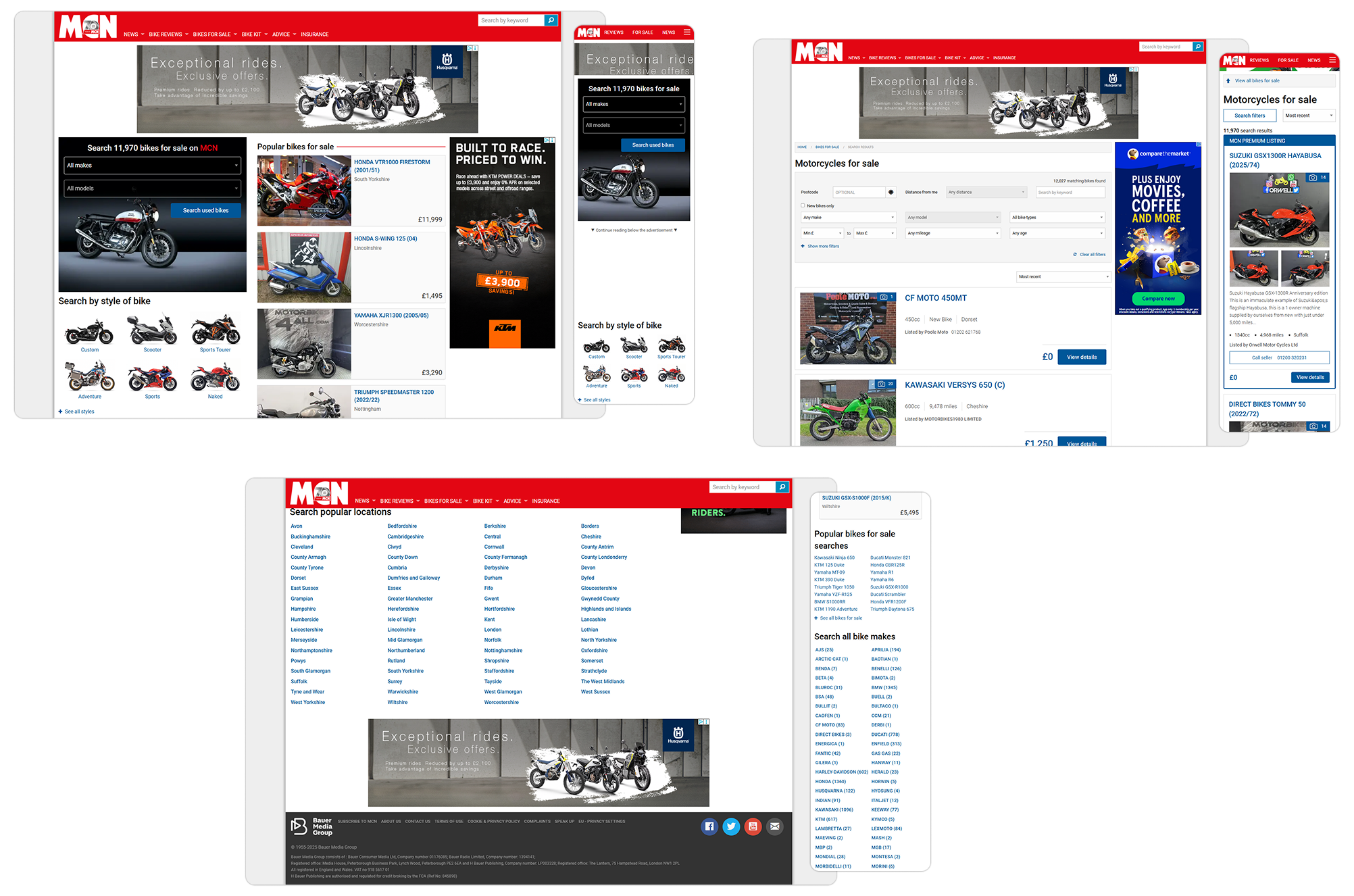
As you can see above, there is plenty to address. Looking at the mobile experience first, it is clear the site was not designed with a mobile-first mindset. Instead of progressive disclosure or prioritising core tasks, the layout is a compressed desktop view. Above-the-fold space is dominated by banner ads, breaking the principle of content-first design. Users are forced into unnecessary cognitive load just to locate the search tools.On desktop, the same issues continue. The visual hierarchy is weak, violating Gestalt principles of proximity and contrast, and making it unclear where the user should begin. Intrusive advertising distracts from the primary journey, disrupting Fitts’s Law by competing for attention with key actions such as “Search used bikes”. Navigation relies on long, text-heavy lists with no progressive filtering, creating high interaction cost and violating the principle of recognition over recall.From a UI standpoint, inconsistency in button styles, tight spacing, and lack of alignment reveal the absence of a clear design system. This undermines Nielsen’s heuristics of consistency and standards, while the cluttered layouts reduce learnability and efficiency of use. The overall experience feels dated, unrefined, and ad-driven rather than user-centred.These problems demonstrate why a redesign was necessary: to reframe the journey around user goals, establish a clear visual hierarchy, and create a consistent, mobile-first interface aligned with modern UX standards.
Analysis & Approach: Utilising competitors' advantages, and identifying weaknesses
Our goal was clear: we must modernise Motorcycle News’ marketplace experience while protecting and amplifying the platform strengths that made it the UK’s largest motorbike marketplace, tens of thousands of listings, deep editorial coverage which resonates well with bike enthusiasts, and market-leading organic visibility. We must not tamper with MCN’s highly invested SEO features, content, or existing links. Instead, we will surface and embrace them within a contemporary design system.MCN’s reviews, buyer guides and longform journalism are not an add-on, they are a competitive advantage. We will weave editorial assets directly into the product experience: model pages that show expert reviews, listing pages that surface relevant buying guides, and contextual callouts that link to how-to content and videos. This creates richer listing pages, reduces buyer uncertainty and leverages the editorial SEO that already drives traffic.Competitor analysis of platforms like Cinch and Autotrader revealed UX patterns and ideas we aim to create for MCN, including:- Brand, location and vehicle-type landing pages that act as conversion funnels.
- Prominent, fast-search experiences with useful defaults and saved searches.
- Detailed filters tuned to buyer intent (price, mileage, year, provenance).
- High-quality imagery and gallery experiences, sometimes including 360 views.
- Clear seller signalling: dealer ratings, verified badges and trust indicators.
- Utilise our lead tools and conversion flows such as one-click enquiries, finance calculators, and part-ex valuation tools.MCN's strengths that must remain, but aim to modernised and adopted:- Brand and model landing pages enriched with editorial summaries and aggregated listings.
- Location-based landing pages that combine local inventory with local editorial (events, dealers).
- Modular listing pages that pull review excerpts, video highlights and “related reading”.
- Well-tailored and organised filters, with progressive disclosure so niche options do not overwhelm new users.Design approachThe visual and interaction language will be contemporary, restrained and content-forward: card-based listings, generous imagery, clear information hierarchy and obvious primary actions. We will design responsive components for mobile-first browsing, keep interaction costs low, and use micro-interactions to make discovery feel alive while keeping page weight and accessibility high.Given the importance of SEO and existing traffic, we will favour an iterative, low-risk rollout: component-driven front-end refactors, server-side rendering where needed, and staged launches behind feature flags. Every change will be tracked with analytics and Search Console. For any URL changes we will predefine redirect maps and continuously monitor indexation and organic performance.With usability research constrained to competitor analysis and prior research, we will lean heavily on quantitative validation: A/B tests on search and listing layouts, funnel tracking for enquiries and leads, and content performance metrics to confirm editorial modules improve engagement and conversions. Key success metrics will include organic traffic, listings CTR, enquiry rate and average time to enquiry.The result will be a marketplace that looks and feels contemporary, converts better, and still benefits from the unique content engine that made MCN the market leader.
Commercial decisions, regarding advertisements
Another major challenge was the intrusive ad clutter, which not only distracted users but also undermined trust in the platform. To address this, we proposed a shift towards a subscription-based dealer model. Dealers paying for premium listings would benefit from an ad-free experience, giving their bikes greater visibility, while lower-tier listings would continue to show ads. These 'premium' tier dealers would also receive other benefits such as more options available on listings, prioritised listings on search, and enhanced integrations provided by iVendi's existing software.After analysing the potential revenue, it became clear that MCN could actually increase overall income while delivering a far cleaner, more trustworthy user experience. This approach balanced commercial needs with user-centred design, ensuring both business growth and improved usability.
My Solution: Building the best user experience for a motorbike enthusiast
A homepage with a true purpose
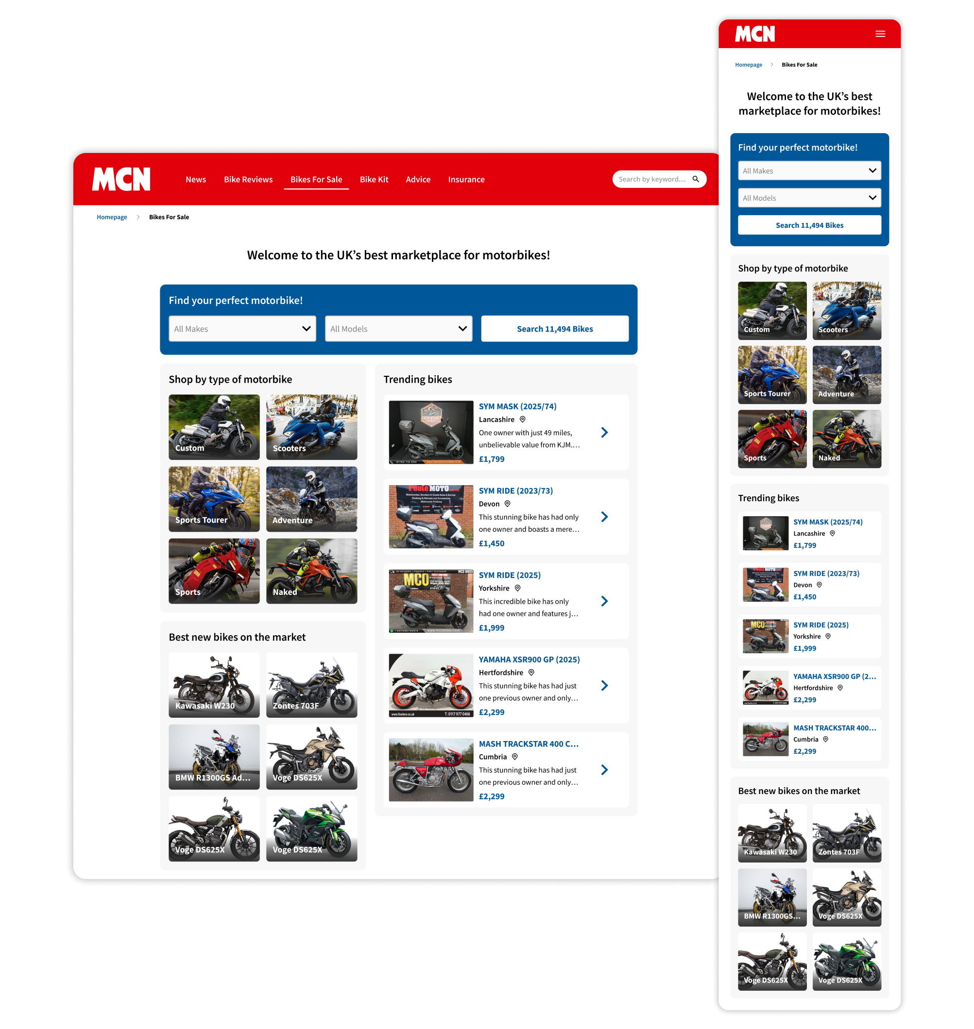
The redesigned homepage tackles the fundamental problems of the old experience by putting users’ goals first. The priority action, to search, is now clearly emphasised at the top of the page in a bold, visually distinct component. This aligns with the principle of recognition rather than recall, as users no longer need to hunt for where to start. It also improves efficiency of use, enabling both first-time and returning visitors to move straight into results. By using familiar filters such as “Make” and “Model” (something which we appreciated from the original site), the design follows the principle of match between system and the real world, mirroring how riders naturally think about finding their next bike.By giving search prominence, I reduced the cognitive load and removed the clutter of competing calls-to-action. Instead of ads and noise taking over, the user is guided naturally towards the results page. This reflects the principle of progressive disclosure: secondary content such as trending bikes or categories still exists, but it is layered beneath the primary task, supporting exploration rather than obstructing it.The information hierarchy has also been refined with principles of proximity and similarity in mind. Related content is grouped, for example, 'Shop by type of motorbike' and 'Best new bikes on the market' sit as supporting modules that aid discovery without overshadowing search. This helps reduce interaction cost and allows users to scan the page more effectively.From a UI perspective, consistency and clarity were key improvements. A defined design system has been applied across buttons, typography, and spacing, addressing the lack of refinement in the old designs. This builds learnability and efficiency of use, two of Nielsen’s usability heuristics. On mobile, the layout has been optimised for smaller screens, placing the search function prominently above the fold. This mobile-first approach solves the previous issue of compressed, ad-heavy layouts by prioritising the primary action where it matters most.
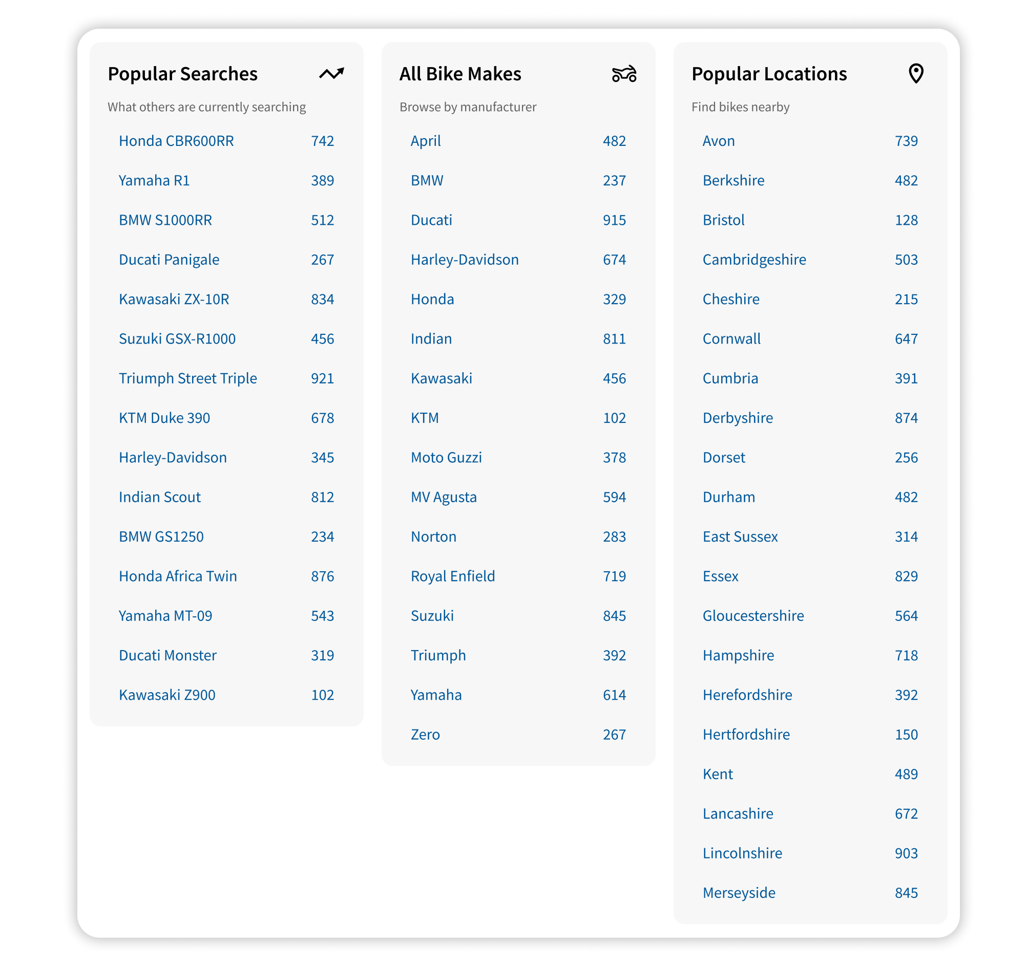
The SEO links above presented a unique challenge: they could not be removed without harming SEO, and analytics revealed they were actually used more than expected. Rather than leaving them as dense, ‘90s-style hyperlink lists (seen in first screenshot in this case study), I redesigned them into neat, structured columns with clear section backgrounds for visual separation. On mobile, the layout now stacks cleanly too. Modern iconography and user-friendly titles improve scannability, while vehicle counts for each category provide visibility of system status, giving users instant feedback on available results. The result is a design that preserves SEO value while transforming the links into a genuinely useful navigation tool.
Motorbike Search Results
The search results page is the intended next step, where users arrive after submitting a search from the homepage, or from an SEO link. This page is crucial, as it transforms intent into discovery, leverages AI to surface relevant bikes and guide users towards the right choice. Its design needed to balance clarity, speed, and flexibility, ensuring users could quickly scan results, refine their search, and progress deeper into listings with minimal friction.
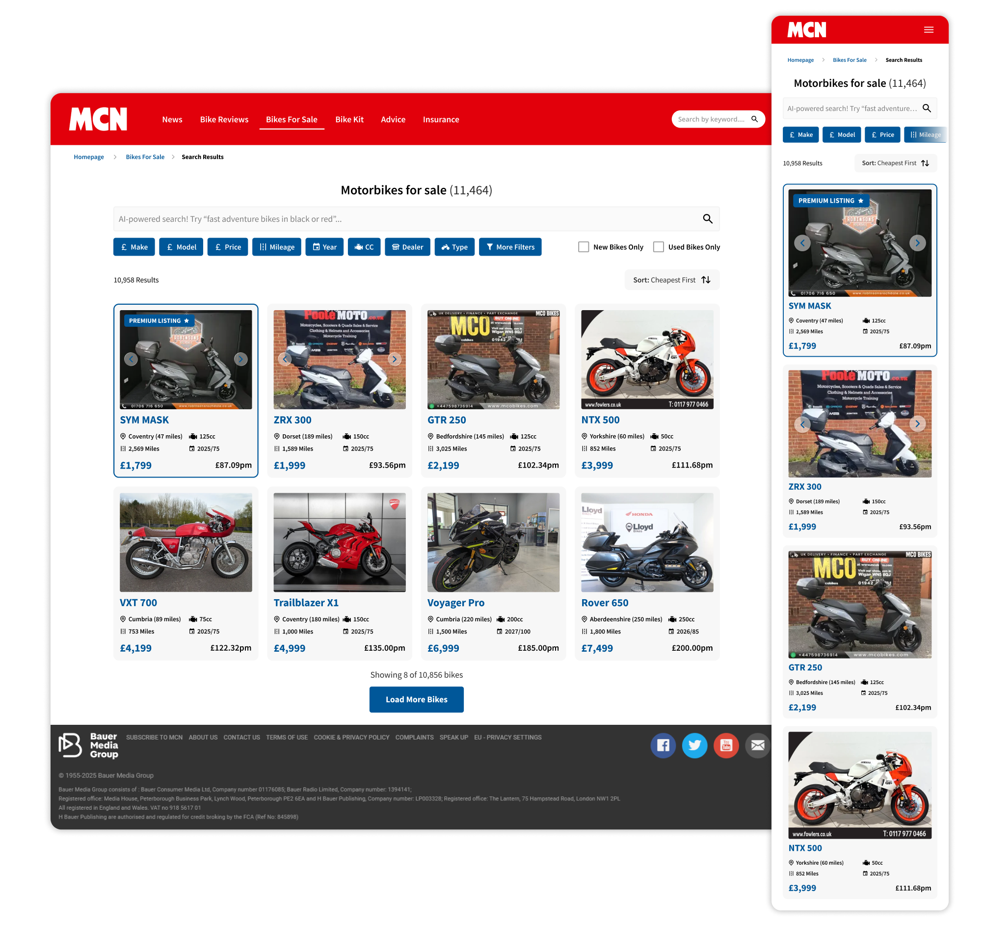
The new search results page is a significant departure from the original, with a focus on clarity, efficiency, and alignment with industry standards. I introduced horizontal filters inspired by Autotrader, ensuring users can refine their search quickly without losing sight of the results. This approach follows consistency and standards, giving users a familiar pattern that reduces cognitive load and supports faster decision-making.We’ve integrated our AI-powered search engine which we have been refining for years, across our other customer-facing products to help customers find their ideal bike using natural, human language. The model understands intent, synonyms and common misspellings, so searches like "fast adventure bikes under 5k near Manchester" return focused, relevant results. It works alongside our filters and result counts to provide instant feedback, supporting recognition rather than recall and reducing the effort required to find the right listing. The outcome is a search experience that feels conversational yet precise, turning broad queries into actionable results quickly.Talking to some in-house bike enthusiasts was extremely helpful in shaping the results page. They told us which filters and data points mattered most, such as make, model, mileage, engine size, location and price, so these were prioritised and made highly visible. At the same time, we removed dealer descriptions from the results page itself. This was because they were often low quality, whilst creating unnecessary noise, harming scannability. By stripping them back, the focus returned to the core decision-making information, making it easier for users to compare options quickly and confidently.Results are displayed using progressive disclosure, with a limited set of bikes shown initially and a clear 'Load More' option. This prevents overwhelming users with thousands of listings at once, addressing cognitive load theory while maintaining a smooth browsing flow.To balance business goals with user experience, premium listings for dealers paying more are clearly highlighted with a tag and border treatment, giving these dealers more visibility without compromising the fairness or clarity of the results. This maintains the sustainable revenue model while following the principle of visibility, ensuring users can easily distinguish between standard and premium content.Additional improvements include better visual hierarchy for price and key bike details, consistent card layouts for scannability, and mobile-first adaptations that keep filters accessible without dominating limited screen space. Together, these changes transform the results page into a cleaner, more intuitive, and more commercially viable experience.
Vehicle Listing Pages
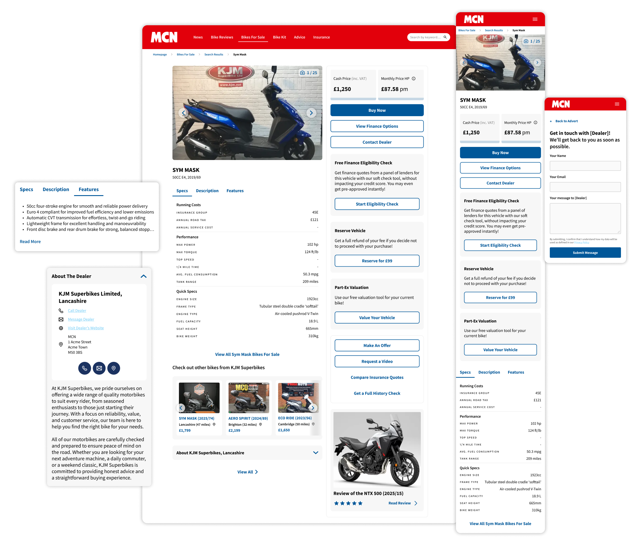
The listing page was designed mobile-first to optimise the experience for the majority of users. The page opens with a large, swipeable image carousel and clear hero information so riders can quickly recognise the bike and its key facts. Carousel swiping improves discoverability on touch devices and aligns with users' natural mental models of browsing marketplace products.We used our in-house bike enthusiasts again to our advantage, as well as competitors to organise technical information, which is organised into clearly categorised specs (running costs, performance & quick specs) and presented under tabbed navigation. This tabbed approach supports recognition rather than recall and reduces cognitive load by letting users switch between specs, description and features without leaving the page. Tabs collapse cleanly on mobile so the most relevant content stays above the fold, again using progressive disclosure.Finance options and pricing are visually prioritised to support the business model, as we will make the majority of our revenue from this project via finance commissions. Cash price, monthly finance and CTA buttons are prominent and consistent, improving scanability and nudging conversion while remaining transparent.We put a lot of effort into, and utilised our favourite parts of competitor patterns for the dealer section, creating a compact "About the dealer" module with contact actions and a short, vetted blurb. Because long, freeform dealer descriptions harm scannability, the module is collapsible and only expands when users want more, preserving focus on core decision data. However, when expanded and anaylysed, this helps gain trust from users. Overall, the page balances commercial needs with usability: a clean visual hierarchy, predictable interactions, and mobile-first flows that make it fast and friction-free to move from interest to action.
SEO Page Example
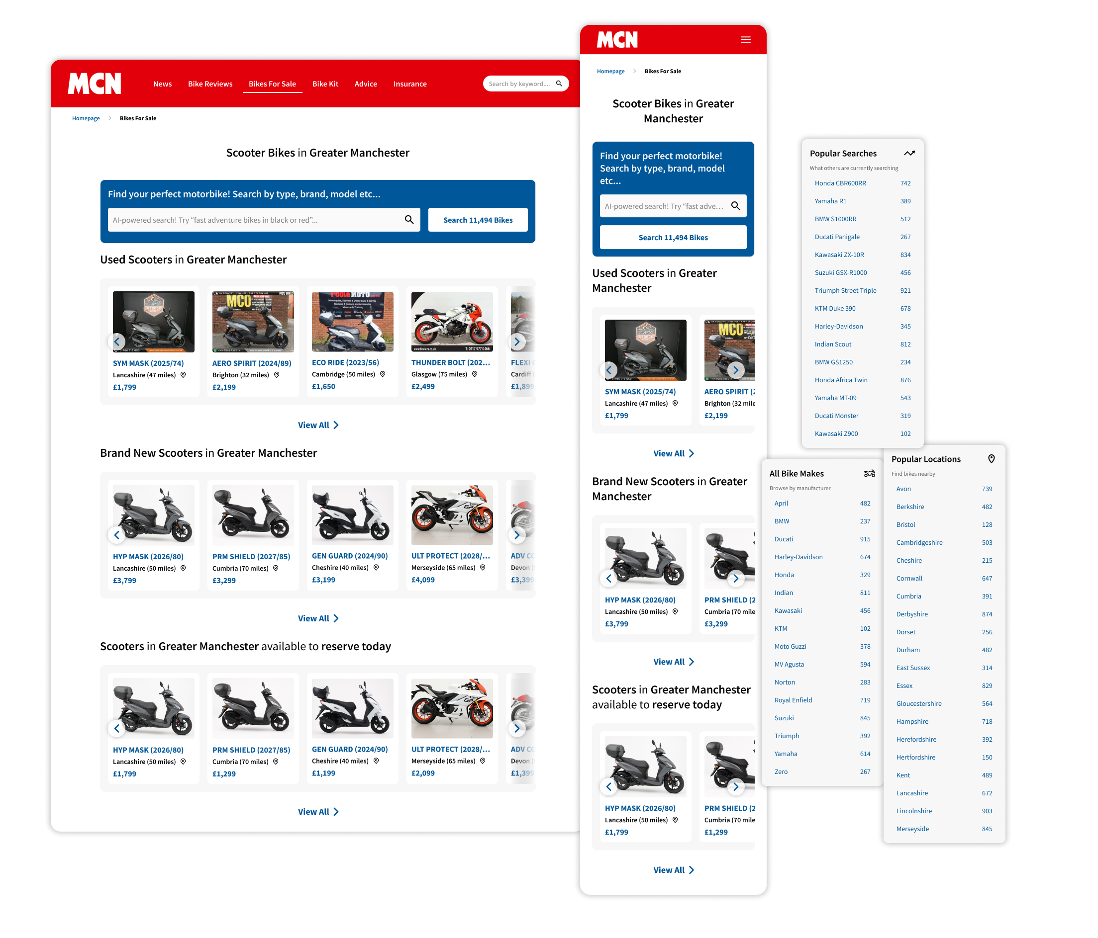
MCN’s SEO strength is the foundation for these pages, so we worked within their editorial guidelines while turning SEO into a genuine UX advantage. Each page is auto-generated from a robust taxonomy of brand, location, type and combinations of each, creating a huge array of pages that search engines and buyers expect. This increases discoverability and ensures the right terminology appears where it matters.Structurally the pages are organised for both humans and crawlers. Clear headings, short intro copy, structured lists and schema-enabled metadata improve indexability while keeping information scent strong for users. Canonical rules and sensible pagination protect ranking while generating a wide range of search combinations.From a UX perspective, we prioritised scannability and progressive disclosure. Neat rows, compact carousels and hard-hitting titles surface the most relevant bikes first, with further carousel categories for carousels inspired by Autotrader to drive action. This keeps pages useful rather than overwhelming.Our AI-powered search sits at the top of the page to translate natural queries into meaningful results. It helps match synonyms, suggested phrases and localised queries so users land on relevant, high-quality listings quickly. The result is SEO that works for people as well as search engines: huge coverage of buyer queries, clear pages that index well, and a conversion-focused layout that nudges users toward relevant results and commercial actions.
Conclusion
I’m proud of what we’ve delivered: a cleaner, mobile-first experience that prioritises search, reduces friction and balances commercial needs with user-centred design. The new homepage, results flow and listing pages are all aligned to clear UX principles, and the changes are designed to drive faster task completion and higher-quality leads for dealers.That said, I would have liked to complement the quantitative data with more qualitative research up front. In practice that means more user interviews, usability testing and diary studies to validate edge cases and uncover deeper behavioural insights. I’m excited to iterate further once the product is live, using analytics, A/B tests and targeted user research to refine prioritisation, tweak details and improve conversion further. Ultimately this is a first major step, and I’m looking forward to evolving the experience based on real user feedback.
Let's connect on LinkedIn.